Becoming Visually Accessible
The Nuances of Picking Accessible Color Combinations
June 29, 2020

Color selection for your brand, company or website is a significant feat in itself and can become slightly more significant when you bring accessibility into the fold. Core company color palettes are now used across hundreds of different places and situations. Many designers run into heartbreak when they fall in love with a beautiful palette only to discover that there isn’t enough contrast between the shades and doesn’t meet accessibility requirements. We tend to hear a lot of, “this blue is too light” and “using white text on top of it doesn’t pass level AA Contrast.”
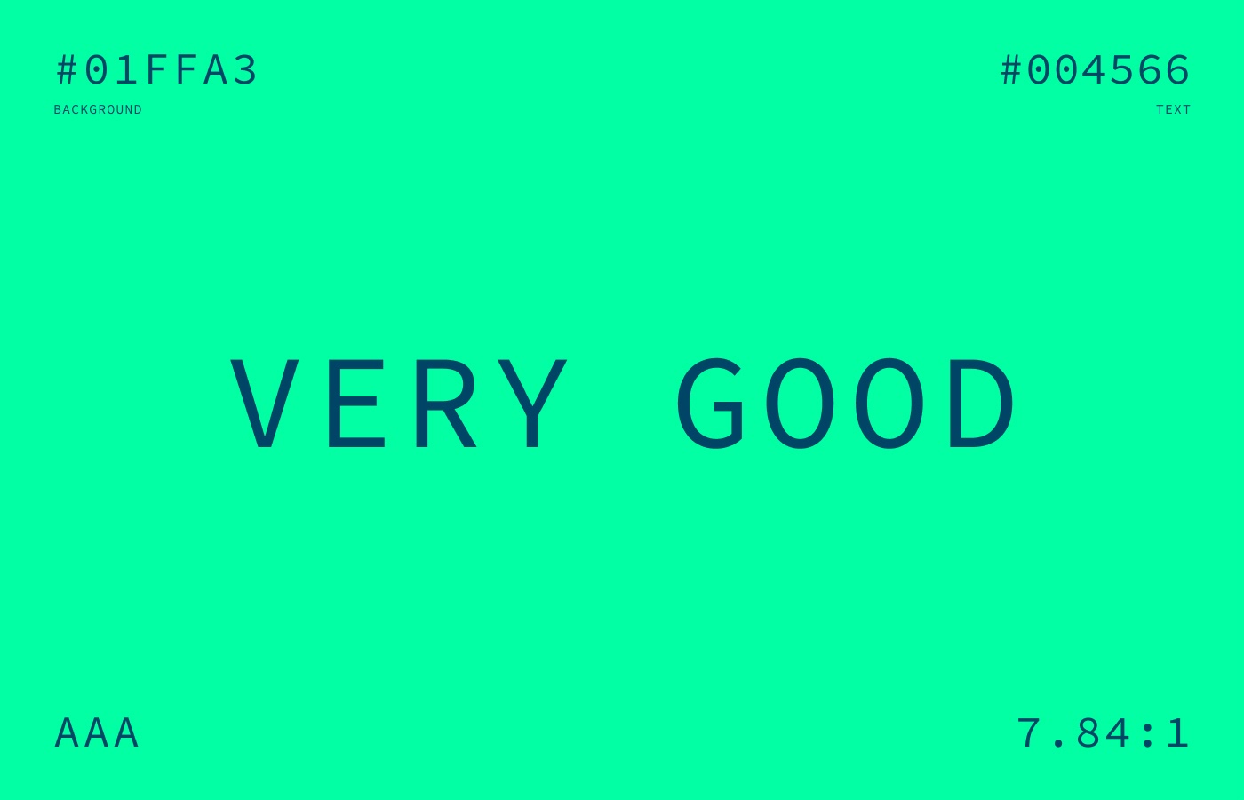
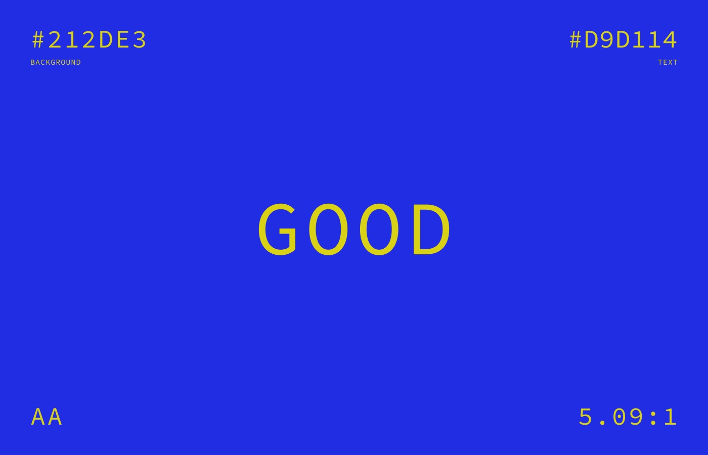
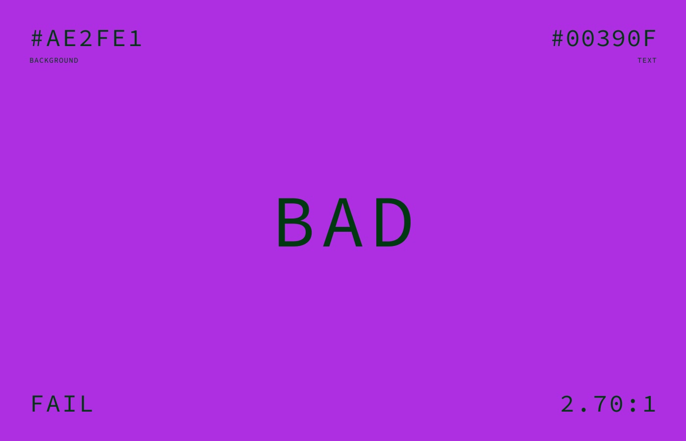
Just to back up a little bit, what does contrast even mean and how is it measured? In the case we are talking about, its the luminance or brightness between the color a piece of text and the color it is on top of, and measuring how readable the text is. This is done so that the majority of the general population can read it without any issues or struggles. This contrast level is measured via a contrast ratio—as a general rule, all your text should hit at least a 4.5 : 1 ratio from its background. This may seem simple, but your eyes can often trick you. Using a simple set of rules, contrast accessibility testing has become fairly easy to conform to.
We tend to hear a lot of, “this blue is too light” and “using white text on top of it doesn’t pass level AA Contrast”
There are four levels of color contrast for the web that we will be taking a look at:
Let’s try a few examples out and see how this starts to look.
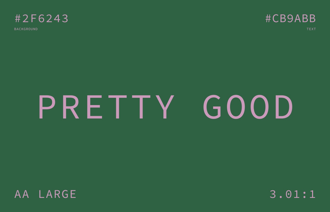
Now, using that failing example above to show the nuances of color selection, we can lighten the background color just a little bit and darken the text just a little bit and suddenly it jumps up to 4.58:1 and passes AA compliance. See the comparison in the .gif below.

There are other situations and strange one-off scenarios where color contrast can be tricky. Another tricky situation is gradients. Many times text will be passing on one side of a background gradient but on the other side, it will fail. This gets hairy very fast and can be a pain to change if caught too late in the design or dev process.
Another tricky situation is gradients. Many times text will be passing on one side of a background gradient but on the other side, it will fail.
Chances are that you are thinking if a project you’ve worked on in the past or the company you work for now meets accessible color standards. There are a plethora of tools available to test color contrast, below are a few of my favorites.
A simple little site by Jxnblk that every designer / developer should have bookmarked. It does a great job showing the color choices in a bold and easy way to digest. The little Hue, Saturation and Lightness sliders make it easy to tweak your colors to get them to a passing grade. Plus, hitting the Random button is so much fun.
This is a solid little tool that is a plugin for all those major screen design tools and lets you check your colors inside your tool of choice. Stark gets bonus points for being able to simulate different types of colorblindness so you can make sure your designs are working for users of all visibility aptitudes.
Testing your type styles over gradients or images can be tricky. This tool takes a snapshot of the webpage and analyzes the difference between the edge of the text and what’s around it, and it lets you know the problem areas. It will become very clear where you might need to tweak your gradient’s color or add an overlay to a photo.
We understand how keeping a color palette or even dozens of color palettes organized can be an ongoing task. If you or your company are in need of accessibility design assistance, dealing with color or any other aspect of accessibility, shoot us an email!
